If you are not familiar with frame design, here are some quick tips to help you achieve good results. It's important to realize that these are all generalizations and there may be some exceptions where you may want to take a different approach to your design.
Mat Border Proportions

 Mat border widths change in popularity somewhat like hemlines on dresses. The current style is the use of wider borders than the typical borders used 10 or 20 years ago.
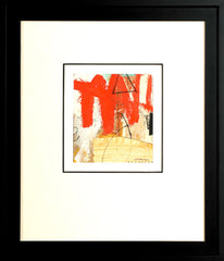
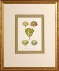
Today many people look at mats as an opportunity to add color to the frame design, but originally mats were neutral in color and used to provide visual relief between the art and its surroundings. More generous mat borders enable you to focus on the art much more easily.
When you do not use a mat, try a Wider Frame Molding

 When your frame design doesn't include a mat, the frame you select may need to make up for it. The frame shown on the left, may have looked nice with a mat border, but without the mat, it looks skimpy and can bring down the perceived value of the art.Using the wider frame on the right the overall size is still smaller than it may have been with a typical mat border width, but it helps make the art look more interesting and important.
Use Conservation Grade Glass or Acrylic

 The design on the left shows this framed art in its original state. Due to damage from ultra-violet lighting (either sun or artificial light) the art and mat faded to look we see at the right.
Conservation grade glazing protects from most of the harmful light rays. By investing a bit more in protective glazing, you will maintain the integrity of your framed art and increase its longevity.
The Shape of the Molding Profile Can Relate to the Art

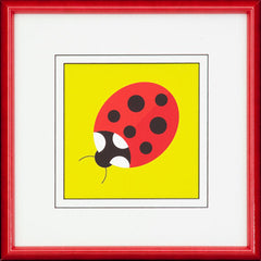
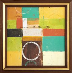
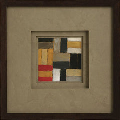
 The rounded shape of the frame moulding on the left relates to the round ladybug, as well as all the spots on the bug. The three square profiles stacked together to frame the art on the right tie to the pre-dominantly square shapes the artist used.
Handle Acrylic with CARE!
The surface of most acrylic is highly susceptible to scratches and scuff marks. You can help protect its appearance by using non-abrasive cleaners made for acrylic and soft clothes instead of paper. Also, use a feather duster, or even better, compressed air from a spray can, to remove the dust particles
Handle Matting

 Many people just assume if there are multiple layers of matting used, each layer needs to be a different color. Actually, using the same color for all layers can simplify the design and keep attention focused on
the art.
When to Use Clear (Shiny) Glass or Acrylic
Clear finish glass or acrylic helps to maintain sharp lines and shapes, bold colors and fine details. The use of non-glare (also called Reflection Control) products can soften or mute these types of images.
When to Use Non-Glare Glass or Acrylic
Non-Glare (also called Reflection Control) has a soft finish and it will diffuse details and colors. It looks great when the art itself seems intentionally soft in focus or muted in color.
Frames Can Vary in Style From the Art

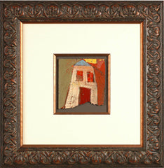
 Many pieces of art look great when framed in a molding style that's unexpected. The art on the left is contemporary in style, but done in a somewhat crude and primitive manner. The frame has those same qualities, helping them work well together. The piece on the right by a folk artist is fun and light-heated, The ornate frame adds a whimsical touch, bringing out that character
High Contrast Frame Designs


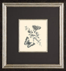
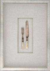
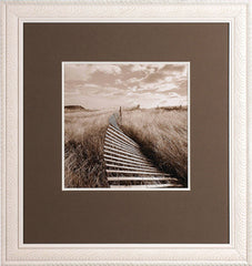
 The black and white photo at left has a much stronger degree of contrast than the print or the silverware. Therefore it looks best with a high contrast frame design. In case you don't know, black and white provide the highest degree of contrast of any colors. The print in the middle is framed using a softer black and creamy color rather than white. This lessens the contrast to relate to thwart. The range of colors in the silverware has even less contrasts that frame design has less contrast.
When to Bottom-Weight a Mat


 A bottom-weighted mat is one where the border below the art is wider than the borders on top and sides. Logical reasons to bottom-weight include when the lower half of the art is darker or contains larger shapes or patterns than the upper half. You may also choose it for a classic look or on art of value that you do not want to cut down.
Designing Multiple Opening Mats

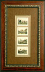
 When you want to place more than one picture in a frame, a multiple opening mat provides the means to bring them together. It is common to use a wider border around the outer edges than the amount of space you use between images. When working with more than a few pieces, it can add interest to use different mat opening shapes.
